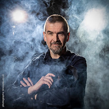
The blog of photographer Kim Ayres

Another new layout

Yes, it's all change once again. The last set of tweaks just made the whole thing too cluttered once more.

After chatting online to Australian Katie earlier today, I realised my basic problem was, I was being torn in 2 directions.

Part of me was looking to create a clean, modern looking site reflecting my photography. However, I already have my photography website doing that.

This blog, on the other hand is about much more than just photography. Here I write about anything that's occupying my thoughts - whether that is family matters, physical and mental health, religion, philosophy, Chronic Fatigue, music, food, overheard conversations, or anything else that grabs my attention. And while photography is a part of it, this is not really a photography blog.

In some ways I think of this place more like a comfy armchair by the fire where you can ponder the universe, play scrabble with friends, or invite people to join you for a cup of tea and a slice of cake.

Once I understood that, I knew I had to declutter but also give it a home-made feel. And this is the result.

Thanks to Katie and everyone who has given me feedback on the changes so far.

Of course, it might have changed again next time you visit...

36 comments

paolo1 said...

I tried to comment yesterday but got bollixed by your word verification mind trap so I don't know why I'm trying again but here goes. I didn't like the remake and I think this one is a vast improvement but I still prefer the original.Going to try to send this but I'm not optimistic.

Amanda said...

I have to say I do prefer this one over the first updated layout. Much less cluttered and easier on the eyes! :)

Eric Fischer said...

Oh you vain, vain man.

Mimi and Tilly said...

This is great! Warm, clear and friendly. The grey felt a bit cold, not at all like you. Big thumbs up for this one! :)

Lee Ann L. said...

I really like this better -- more pleasing to the eye! :-)

mapstew said...

I like. :¬)

soozie said...

Love the comfy armchair idea .. though i might bring a glass of pinot grigo :) !!

Ponita in Real Life said...

Yes, this one is much more comfy than the last version. Very nice!

Unknown said...

I am sick of this. I like everything you do. Cluttered or uncluttered. I feel like if you threw up on the screen, I'd say, wow that is nice. Good stuff.

angryparsnip said...

Love Carole's comment she is so funny.

I think you may have hit on a good idea here.

cheers, parsnip

A Daft Scots Lass said...

I love the new look. Its easy to read and uncluttered.

Katie Roberts said...

Wow!

You were all just being polite or quiet before! ;) Great to hear I am not the only one that found the other a bit too busy.... anyone one would think I would be the careful one. I am half English, you would think I was the polite, quite, nice commenter...

.... apart from I am also half Australian and we dont tend to like polite bullshit! ;) (yes we also tend to be loud and swear)

Apologies if I offended anyone (thats the English in me!)

Love is a comfy armchair by a fire in Scotland. good work Kim. But now this ones a bit too boring! dont you think everyone? go on you can tell him!

You do like to go from one extreme to the other, dont you Kim?

I know I and most of us here will be loyal readers and commenters as long as you keep being you - so thats a long time really! ;D

Love your work,

Kd

Brindy said...

Like this one, much easier on the eye.

Chrissie B said...

Ooh, that's better! I like the autumnal colour scheme and the less busy design - it's cosier and friendlier somehow. (The mono revamp felt a bit too chilly!) Of course, I liked the original too - and I'll keep reading, whatever your final window-dressing looks like. :-)

Cannwin said...

I love the clean look too, but I also like the super girly, shabby, lacy, vintage look... it's a problem I've never been able to come to terms with. Luckily for me my photoshop expertise does not extend very far into the shabby-chic realm so I go with clean lines. :)

Pat said...

If I care enough about a person to read their blog regularly what matters most is ease of access, readable font size and colour.
I'm fairly strict about reading other's blogs regularly so it helps if one doesn't have to spend precious minutes waiting for it to settle down. But that's just me:)

Anonymous said...

looks great!

V said...

Hi Kim, this is just so much easier to read! And I'm pleased to see you back as you, not just one of many faces.

Funnily enough, your layout before the last and any recent changes was partly what drew me into Ramblings etc. The old black and white header, with photos et al. You were staring out of the page (or is that just my imagination and faded rememberings?) and the man at the heart of it was immediately present and engaging with his readers. From the photos on that older layout, you came across as being very 'real'.

Anyway. Hope you settle on new layout soon. Pesky computer still not allowing me to change mine at all, photos disappeared etc. Bah hum bug! Vx

Kim Ayres said...

Paolo1 - looks like your comment made it this time :)

Amanda - a step in the right direction then :)

Eric - come and sit down here by the fire and tell me what's on your mind...

Emma - I felt the grey version was cold too - looked almost blue on my monitor

Lee Ann - than the previous update, or the last full version?

Mapstew - :)

Soozie - sounds good :)

Ponita - glad we got there in the end :)

Carole - I'll check the blogger template design options and see if they have one called "vomit" ;)

Parsnip - I hope so

Gillian - ah good :)

Katie - there really is no pleasing you, sometimes! I appreciate you taking the time to chat with me and help me straighten my thoughts. Part of those thoughts, however, were that the entertainment is in the content rather than the design, which is static (and thus ceases to be noticed quite quickly). So clarity and the ability to find what you want easily, are higher priorities. It needs to have enough of a personal feel without being swamped, which is what I feel was wrong with the last proper version of the site. I'm still happy with this one today :)

Jacqui - I'm glad :)

Chrissie - I think most people prefer the original in terms of look, but I do think this is much easier to find your way around. The 2 columns on the right was just too cluttered.

Cannwin - I've never tried the super girly, shabby, lacy, vintage look - perhaps next time :)

Pat - if you are using Internet Explorer, you can change the text size any time by going up to the menu bar, then click on "View", then "Text Size" and you can make it larger or smaller as required

Cassy - thank you :)

Kim Ayres said...

V - passed you in the ether there - you must have posted while I was replying.

If you go into your blogger dashboard and design area and choose a new template, then you should be able to start rebuilding. Send me an email if you run into problems

savannah said...

i read the words, everything else is gravy, as we down here in the south, sugar! ;~D xoxoxoxo

btw, have you seen my blog? tis to laugh at its straight from blogger template land look!

AA said...

Kim, Though this is nice too, calming actually, but reminds me of..... erm.... mine. In that it doesn't look like you've done much fancy techie stuff to it.
I associate you and your blog with fancy, arty, creative techie stuff. But I could have you all wrong. :)

neena maiya (guyana gyal) said...

Still clean and uncluttered, which I like.

I kinda miss the manly-grey, haha.

Actually, it's cool that you can change the colours to suit your mood, isn't it?

Apex Zombie said...

I like it!!!

Simple, effective, and produces the results you're after with a warm but neutral palette.

snoble24 said...

this one just looks a little to drab to me. it need a little something colorful to me. but hey its your blog

Ron said...

I like it Kim! Very clean and 'homey.' By the way, I found a great photographer. His name is Mark and his blog is "Our Simple Lives." I met him this Sunday. I've hired him to roam around and take pictures (and a lot of portrait pictures) at my family reunion this coming October. I think I found a "Kim" in the states!

The Birdwatcher said...

like the new layout, need to do something about my ragbag.

Anonymous said...

Cool! Well not the colors, their warm I mean I like the look. Clean.

Anonymous said...

I too love the warm look and feel of this new layout. It's hard to capture all of ourselves in a small frame isn't it?

Kim Ayres said...

Savannah - nothing wrong with tha simple template it's the content that counts. It's just that I can't stop fiddling with these things :)

Adila - Creating something simple, but effective is much harder than creating something complicated and messy :)

Guyana Gal - the manly grey was looking too cold. Perhaps that's not a problem in a country where the temperature is always warm, but living here in Scotland, a touch of warmth is vital :)

Kepa - thank you :)

Snoble24 - is yours more exciting?

Ron - there is another Kim Ayres in the states - visit kimayres.com - she's a female bodybuilder :)

Birdwatcher - there are plenty of templates and variations to play with :)

Allen - thank you :)

Starrlife - it's impossible to capture ourselves in one look - in the same way you cannot capture an opera in a single note. All we can ever do is hint :)

Anonymous said...

Clearly I missed the in-between layout, but I must say that I very much like this one. It is, as you said, both cozy and easy to navigate. :)
Although you could post in blunt crayon on an old paper sack and I would still love to read your blog.

Kim Ayres said...

A blunt crayon on an old paper sack sounds quite creative, actually :)

Jayne Martin said...

At first I thought I'd taken a wrong turn, but I see you've just done another switch-a-roo to keep my on my toes. I think I still like your original one best but as you can tell by my same ol' place, I'm not much one for change. Still, it's quite pleasant.

neena maiya (guyana gyal) said...

Hmm, interesting how our choice of colours can be influenced by where we live, isn't it? I hadn't thought of that.

Falak said...

Love the new look! Simple yet classy :)

Kim Ayres said...

Jayne - it's just a matter of time before it will change again. For me change is a part of life, and I start to feel a bit unsettled when things don't change for a while...

Guyana-Gyal - not just colours, but all sorts of things - religion too, for example. As someone once said, the gods that develop in harsh environments tend to be viewed as bigger bastards than the ones where the climate is moderate :)

Falak - Thank you :)

All content copyright of Kim Ayres. Powered by Blogger.