The blog of photographer Kim Ayres

I need your assistance

.
This past week has been rather busy and intense.

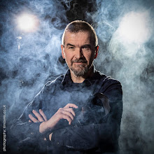
For quite some time I've been unhappy with my portrait photography website.

The scrolling album system I was using didn't seem to work in some browsers; the galleries felt a bit cluttered and random; the selection of images didn't really reflect the direction my photography has moved in; and despite the fact I thought a black background looked kind of cool, there's no doubt it was harder to read.

I knew I had to change it, but it wasn't that straight forward.

I needed to think about how it should look, how I should organise the content, whether I should expand or streamline, and find a new way of displaying the images that was likely to work in more browsers.

And I had to do this while still suffering from an endless virusy-flu type thing most of the family has had for several weeks.

One side effect of all this is I've been rather lax in my blogging life and am way behind on keeping this site up to date and catching up with my favourite reads.

However, finally, it is now up. But I could do with a little bit of feedback from anyone who can spare a few minutes.

If you can, please visit: http://kimayres.co.uk/

While you all know I'm a sucker for flattery, that's not really my concern this time. The simple fact is, the website is the face, the shop window of my business. Potential customers could make the decision whether to call me or not depending on whether it sends the right messages.

What I really need to know is what you think works, and what doesn't. If you were a potential client, would it be easy to find what you needed to know? Does the look inspire condfidence or put you off? Do the links all work? Are there any glaring spelling or other text errors?

Thoughts, comments and feedback are extremely welcome. And if you'd rather not say anything in public, do please email me - my address is on my blogger profile, or the website.

Many thanks.

.

14 comments

Lynne said...

Okay I hope I don't come across as mean and nasty.
That said...I like it, The flow of the pages work, easy to navigate around and find things. But...for me, I like a little more "smile" in my photos, a twinkle in the eye. All your photos on the first page are very serious and a little "harsh". The photos you have up on your "options and pricing" page, now those would make me think about hiring you, I like the way they all look, so different from each other. I also like the way the different faces in your portrait galleries, it's shows that you are willing to work with all age groups. If you are asking if I like your website the answer is a definite yes! If you are asking for my opinion on how I would feel about it as a potential client, I would have to meet and talk to you in person to see if we would be a good fit with spending so much money and a bit of time with you.
okay don't hate me for speaking my mind.

Fay Campbell said...

I sent some wording to your email for your consideration.
I LOVE the black and white that greets me to the website. Very hypnotizing.

Vicky said...

Love the new layout, but I agree with Lynne that perhaps a little bit "lighter" on the front page.

mapstew said...

Hey pal, I'll be back when I'm more sober to comment on your present topic, but, I just happened on your profile (hit the wrong thingy, as a drunk does), and I noticed one has had more than 119225 'lookies' on yer profile! Ain't YOU pop! :¬)

Susan Carpenter Sims said...

I like it. I especially like the "About" page. You do a great job of explaining in lay terms what portrait photography has the potential to be. It's inspiring, and if I could afford you and lived in the U.K., I'd totally hire you.

Now for my nitpicky editor stuff.

Under "Options and pricing" - The Fantasy Portrait, the last two sentences are fragments and should be joined. And I would rephrase it to say the "only" limit is your imagination.

Also, you're missing periods at the end of the final sentences under The Portrait and The Professional Portrait.

LegalMist said...

Missing periods on the "About" page, paragraphs 5 & 6. Love the photo on that page!

On the "Prices & Options" page, in addition to the comments above, I noticed periods missing undre "Satisfaction guarantee" and "No hidden charges." Also, under "Things to consider," I think there are too many "etc"'s - can you come up with some variations?

Also on that page, under "Location," you've separated some items with commas, the last with a semi-colon, which doesn't make sense to this American reader. I'd use all commas for consistency, or you might separate the two types of "variables" with the semi-colon such as: indoors or outdoors (not forgetting the weather); at home (which rooms?), at work, in public places.

Overall, a very nice job. I like the "clean" look of the black & white.

I'd add more photos on the first page so there are some to scroll through.

A Daft Scots Lass said...

I love your style!

I hope you're all feeling better now.

Mary Witzl said...

I can see what Lynne is saying about smiles and eye twinkles: a lot of people want photographs of themselves that are traditional poses (big smile, happy face, best clothes) and those kinds of people might be put off by the artsy nature of your portraits. I'd suggest throwing in a handful of 'straight' shots like that if you can, interspersed with the ones you have there. I think they're fantastic, and I'd personally like to see more. Also what about a few more family shots? I can think of a few you've taken that would look great there! :o)

Your wording didn't bother me one iota, not even the missing periods. Sentence fragments don't always seem wrong to me. Sometimes I think they make our language sound more relaxed and stylistically felicitous. Better than usual. Like advertising copy.

Aoife.Troxel said...

I like the navigation, and the gallery, they are both much easier. I thought the black background was cool; serious, but not too serious, like your photos. I agree with Lynne that the "home" photos wouldn't make me hire you, but I like the ones in the gallery. I love the "about" page too.
But the white background just seems casual to me.

Kim Ayres said...

Lynne - Of course you haven't come across as mean and nasty! I appreciate your thoughts and the fact you have taken the time to write them down for me :) I take your point about there not being much on the site by way of smiley faces, but there is a reason for that, which I now realise I forgot to mention in the post, so please watch out for the follow-up post I will now have to write...

Fay - I received your email and have replied. Thank you once again for your thoughts :)

Vicky - I take your point and, in light of yours and Lynne's response would ask you to read my next post :)

Mapstew - it all came from the Blogs of Note thing last year. Hope your hangover isn't too bad today :)

Pollinatrix - nitpicky editor stuff is always appreciated. Missing full stops off the end of my sentences is something I know I have a real problem with. And I like the addition of the word "only" so have added it :)

LegalMist - thank you for the grammatical proof reading - between you and Pollinatrix, I think I've managed to clean it all up - greatly appreciated :) However, I didn't find the semi-colon you referred to, only commas. I have added a couple more images to the front scroller, but I don't want too many as the majority are in the main gallery within - just a taster

Gillian - thank you :) Not feeling that much better, I'm afraid. This flu-like thing just doesn't want to go away.

Mary - I have added a couple of photos of the grandchildren for a bit of light relief, but I'm hesitant to do more. As I mention to Lynne above, please read the next post. And thank you for your support of my sloppy grammar :)

Aoife - I know what you mean about the black background - I really did try to make it work, but in the end I couldn't find a way to do it to my satisfaction. If a site is just images, the black works really well, but as I have large amounts of text, the switch of light and dark has become necessary. Thank you for your thoughts though - I need the full range of opinions :)

litzi said...

Hi Kim,
Whew! By inviting suggestions on how to improve your portrait photography website, you might be thinking about now be careful what you ask for….

Kim Ayres said...

Litzi - it's always a danger to ask other people's opinions, but occasionally it pays off... :)

Unknown said...

Other blogging friends who are professional photographers swear that photos look better on a dark (preferably black) background Kim. Okay, I know that makes any text hard to read for readers (and in your case clients) and I think the secret is to make your text a light grey in colour, its so much easier on the eyes. Just my twopenceworth

Kim Ayres said...

Thanks for your feedback, Technogran. With the black/white issue, all I can really do is refer you to the answer I gave to Aoife above

All content copyright of Kim Ayres. Powered by Blogger.