Meg, with attitude
As I've mentioned before, half the fun of photography for me is taking the photos and the other half is playing with them on the computer.
I recently bought a new laptop to help me with the photography business. The one I had been using was not only 4 years old, but had been bought back in the days when I intended to become a writer. Consequently, I made my choice based on things like battery time, rather than graphics cards, and so manipulating images was becoming a slow and cumbersome process
This new one is much better - I don't have to wait 30 seconds between each action in Photoshop, and finally I feel I have a tool to help me achieve what I want with much greater ease.
Wanting to have something fresh to play with, last week I decided to take some photos of Meg, so I plonked her in front of one of Maggie's large blank canvases and got her to move her head about and pull different expressions.
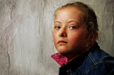
This was one I ended up with, which I felt had potential. I liked the sense of "attitude" in Meg's expression
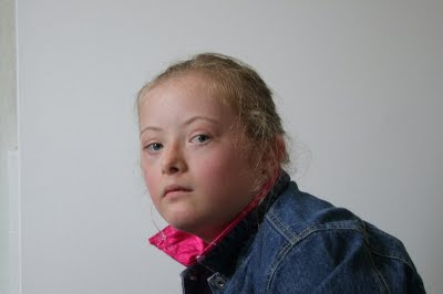
The first thing I needed to do was rotate it a bit so Meg didn't look like she was leaning forward, and then I needed to crop it to give it a better balance.
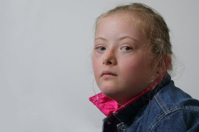
The photos were taken in the front room in natural daylight, but it was dull and wet outside, so the next thing I needed to do was enrich the colours, which took a few different combined techniques. Eventually I was pleased to reach a point where I felt the denim and the eyes complimented each other, as did the pink collar and her cheeks.
I knew the colours were slightly overdone, but that was OK, as I planned on pulling them back later
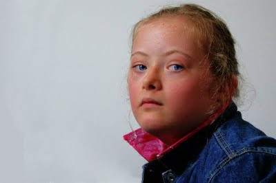
From the start I envisioned a textured background, so used a close up image of part of one of Maggie's artworks. If you revisit my post, Half the Fun, you'll see I used the same image on that one too. This time, however, I tweaked the tones so there was a subtle pink and blue shift to match the jacket and the face.
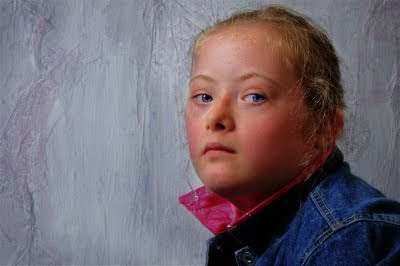
Finally I added a sepia overlay, which pulled the colours back from being over saturated and gave it an extra layer of depth.
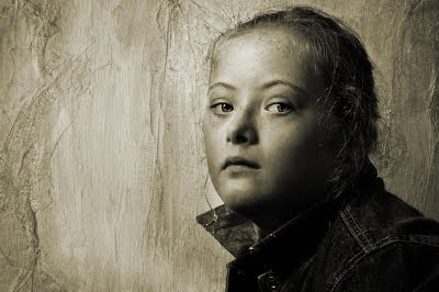
I also did a black & white version (with a very slight sepia tint) which has quite a different feel to it, but I like it too.
You can click on any of the images for larger versions
.



Post a Comment