
Mambo Jambo
Regular followers of this blog will know I’ve been involved in photographing performers each month for “The Mill Sessions” – a mostly acoustic venue at The Mill on the Fleet, in Gatehouse – a town about 15 miles from here (see Mill Sessions Posts).
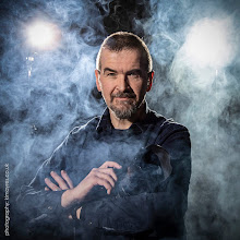
The last gig was by a charismatic, fun, talented couple who go by the name Mambo Jambo. Unfortunately, it was also on the Saturday evening of the Spring Fling weekend, so I was unable to attend the gig.
Normally the performers are asked to turn up an hour early so I can have time to chat with them, get them to relax with me and get some shots of them for the “Hall of Fame” The Mill is looking to develop. But with me tied up photographing visitors to my studio all weekend, the only solution was to bring them to me.
So mutual friend, Alan McClure (singer in The Geese, who I did the CD Cover shots for), bundled them into his car and drove them to Castle Douglas. They patiently waited their turn then I had about 3 minutes to rattle off a series of shots in the hope that I could get something halfway decent before those in the queue behind them would start getting bored and wander off.
I would love to have had longer with them. There is a wonderfully light and playful quality to them and I know a photo shoot of an hour or more would be a great deal of fun.
However, I managed to get a shot which fitted on the wall of the weekend open studio event, and I think is probably passable for the Hall of Fame shot too.
Now to date I’ve been keeping the shots in black and white as a kind of “house style.” Taking the colour out of a photo often means we fill the gap with mood and atmosphere. And when looking at the image with the pinkish-purple background I was using, the colour didn’t work so well. But after a sudden burst of brain activity, I turned the background blue and it seemed to lift the whole image, and I now suspect the colour version has more impact than the black and white.
What do you think?
As usual, click on the images for larger versions


Websites:
The Mill on the Fleet: http://www.millonthefleet.co.uk/
Mambo Jambo: http://www.mambojambo.org/


Post a Comment